All Posts in Personal Blog

December 20, 2014 - No Comments!

Podcasts to Binge On

Ever since I moved to LA, and I am commuting in my car as opposed to public transit, I traded in my kindle for listening to NPR.  Sadly, most of the time I am actually driving the programming is not the most compelling.  (I know I live in California, but do I really need to hear about ballot initiatives in San Francisco every day?)  Instead I have turned to downloading (and often) binging on certain Public Radio Podcasts.   These are definitely ones worth your iphone memory.

Serialserial
I know this has been all over the news, but it is certainly worth it.  There is something about Sara Koenig’s narration style, the music, and the story that make Serial addictive.  (I will definitely start listening to This American Life just to keep my Koenig addiction fulfilled while waiting for Serial Season 2).  I must say I was slightly disappointed that Serial didn’t end tied up in a nice little bow.  There is something very compelling about the difference between the justice system (and almost every other system that uses information) now and in the 90s - pre cell phones, pre instagram, pre facebook.  The podcast delves into the murder of a high school student in 1999 and her ex-boyfriend who is serving life in jail for the crime.  Koenig weaves the stories of the players and the facts of the crime over 12 episodes, and both she and the listener oscillate between believing in the guilt and innocence of the accused.  I have no idea how Koenig is going to chose the next story, as she researched this one for over 2 years.  I can’t wait to find out what she picks.

99% Invisibleinvisible
This podcast is narrated by Roman Mars, and the name comes from the fact that Mars attempts to focus on the intricacies in life that we don’t usually notice.  He is sponsored by an architectural firm, so his subjects are often design based, but they are always intriguing.  He did a show on Wonder Bread, on a crazy building in Germany with no right angles, on the history of the chair, and on the Port of Dallas.  His podcasts are incredibly well mixed and also relatively short - each one is a nugget of undiscovered information, possibly something you can only use on Jeopardy or Trivial Pursuit, but worth keeping in the back of your mind.

Radiolabradiolab

Radiolab also takes advantage of incredible sound mixing and off the beaten path stories.  Radiolab explains themselves best:  “Radiolab is a show about curiosity. Where sound illuminates ideas, and the boundaries blur between science, philosophy, and human experience.”  They did an incredible podcast about the AUMF (authorization of military force which has propelled us into the eternal middle east wars), Patient Zero (tracking AIDS and Ebola back to their source), a dolphin and a woman who lived together in an apartment in the Caribbean (yes the apartment was built like a pool), and even an entire show about Buttons. The podcasts often sound like a group of friends just hanging out and chatting about out there subjects, while throwing in intelligent commentary and interviews.  The subject matter is curious and well thought out, and also very much worth the time to listen and laugh along.

December 12, 2014 - No Comments!

Big Eyes for the Modern Eye

mari kimTim Burton’s Big Eyes has burst into theaters this season, telling the story of Margaret Keane and her big eyed waifs (and the fraud her husband committed surrounding them).  The paintings were the height of 1970s kitsch - each showing an apparently scared (or scarred) child with a focus on their out of proportion eyes.

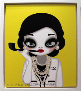
Earlier this month, I had the pleasure of attending Context - an art show in Miami during Art Basel weekend.  I stumbled upon the artwork of Mari Kim, and I was immediately  mesmerized.  She refers to her works as Eyedolls.

Kim also illustrates cartoon-like characters with big eyes, yet she uses real life inspirations for her work.  She created an entire series around movie stars and fashion icons - entitled The Famous Show- and her pictures of Marilyn Monroe and Coco Chanel are charming and vibrant, unlike Keane’s depressing works.  She also chose to include Marie Antoinette, Margaret Thatcher and Gloria Steinem, either as a tribute to the most influential women in history or a play on their feminism.

Kim also created the Eyedolls as windows to the soul, but she sets her work in a more uplifting tone, stating that the images are meant to convey the women as “children with limitless potential.”   Kim uses highly saturated colors and digital illustrations, removing the brush strokes, and the only work done by “hand” is her signature and the name of the piece at the bottom of each canvas.

To me, Kim’s work is humorous, charming and dynamic.  Whether one of her Big Heads or her Famous Eyedolls, I am saving up to purchase one for my living room wall.  Unfortunately for me, I suspect that her work should take off on the wave of the success of Tim Burton’s movie.

December 7, 2014 - No Comments!

Aqua Art Fair – Type and Color

Aqua Art Fair is in itself an experience - the Aqua Motel is transformed into a series of galleries, each room is removed of its furniture and a gallery takes over the space.  The courtyard has a DJ and a bar, and each room opens onto the courtyard.  The experience is very Miami Beach - open air, open art, and exotic people.

I had never visited this art show although I grew up in Miami Beach, and I was excited to have the experience.  I was entranced with the environment, and I was really drawn to two particular artists who used techniques I felt would be great projects for graphic design students.

GarrisonRichard Garrison
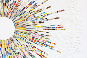
Garrison uses gouache, which in and of itself was a triumph for me.  He transforms every day color experiences into unique, abstract geometries full of humor and artistry.  His parking lot series was a large canvas filled with many swatches of different shades of grays and browns, and it one was labeled by the location of the asphalt - outside of the gym, grocery store, etc.  Some of my favorite of his works were spiral palettes containing the colors of the pages of a Target mailer - the junk food section had bright reds and oranges, the cereal blues and browns.  I don’t think I could have understood his work before I took color theory and had to create color palettes for myself, but I think I would have always been drawn to his shapes and geometry.


hollierDavid Hollier
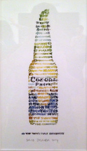
Hollier uses type to create images that also portray the message of the type.  His series on display used works with a profound and often positive message - John F Kennedy, George Washington, and the Beatles.  One of my favorites was the 21st Amendment written in the shape of a Corona Beer Bottle.  He uses hand made type as well as actual typewritten type depending on the context of the message.  This series also reminded me of a project from my first Typography class, and I wish I had seen his messages to take inspiration and joy.

November 26, 2014 - No Comments!

Print is Not Dead

I am a sucker for a fabulous cover.  I love to wander the magazine racks at newsstands and just ponder the imagery and typography of the magazines, whether they are American or foreign, about fashion or design or even writing, targeted to men or women.....I just love the idea, the smell, the feeling of a good magazine.

Recently, I have discovered two new (to me) amazing magazines.

monster-children-magazine-40-1-01Monster Children
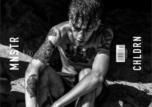
Monster Children is written in Australia, but certainly lends itself to the LA sensibility.  It comes in a horizontal format and is dense with imagery.  The pages have a heavy and printed feel to them.  The subject matter is often about artists, skateboarders, musicians, but the layout is unique and the typography very dynamic, graphic and outrageous.  The first issue I saw was guest edited by Mike D of the Beastie Boys, and he fit right into the pages.  Although the magazine is horizontal, the editors also use a lot of sideways type both throwing off the reader and drawing you in.  The Table of Contents are consistent across issues, and there always seems to be at least one semi-nude image of a beautiful model, yet the use of typography is strong and dynamic, with color bars, hidden letters, and lots of scale change.  I haven’t read many of the articles in Monster Children, but I immediately subscribed, and I love flipping through the pages.

uppercase__full

Uppercase
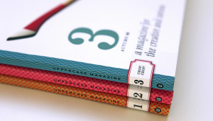
Uppercase is a Canadian magazine dedicated to creativity and design, and often type.  I first heard about the Magazine on Twitter, as their posts are often playful and the images sucked me in.  The magazine is quarterly, and the twitter posts keep me excited to see the next issue, despite having to wait 3 months. The first issue I received was all about hand made type, and the layout was gorgeous.  I was particularly drawn to all of the pattern work - on the cover, on each feature, on the table of contents - always delicate but always dynamic.  Uppercase is an independent magazine, and seems to have a well of unique and creative articles and illustrations.  This magazine will forever be on my coffee table.

November 2, 2014 - No Comments!

Grand Central Market

grand centralI haven’t spent much time in Downtown LA, but I have always wanted the excuse to go.  As any Angeleno knows, you need a really good excuse to get out of your neighborhood and drive the 45 minutes (12 miles) to get downtown.  My previous excursions to downtown had been to see the Disney Theater and jury duty, so I was looking for another adventure.  I had read about the Grand Central Market, and it reminded me of New York’s Grand Central Market and the Chelsea Market, so I grabbed a few friends, and we made an afternoon of it.

Sadly, it did not live up to the hype.  The Market did have some great restaurants - not sure if you can call a market stall that.  We decided to give Egg Slut a try, and we waited in the 15 minute line while people watching (it happened to be Halloween, so the watching was worth it).  We thankfully scored three seats at the counter, and our sandwiches of egg and cheese on a buttery brioche were definitely worth the wait.  We checked out the deli, the ice cream store, and the Thai stall, and they all looked amazing, but that was the extent of the market.

The actual market stalls were rather depressing - the fruit looked old and bruised, and the cheap prices almost too high.  We could easily score better goods at any local farmer’s market.  The stand with spices and mixed nuts seemed appealing from afar, but the goods too looked like they had been sitting there for ages.

The Market is also deep in downtown, and the streets are not welcoming. Even after living in NYC for 20 years, I didn’t feel safe on these streets at 1pm in the afternoon on a weekday.  While their are plenty of pedestrians and cars, and lots of movement, the streets still had a dark and eerie feeling, almost ominous.  This was not the LA of the movies, or of my home.

I will go back to the market, and I will try another market stall, but I’ll wait until they revitalize more of downtown.  Maybe next time I’ll try the Last Bookstore, and immerse myself in the scent of used books and listen to an author read samples on the scratchy microphone - that would definitely be an excuse for the drive.

October 15, 2014 - No Comments!

The Modern Kimono

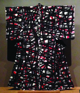
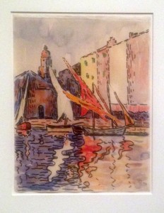
kimonoI am a member of the LACMA’s Costume Council, so when I saw the invitation to visit the LACMA on a private tour with the curator of the exhibit I jumped on the chance.

Sharon S. Takeda, Senior Curator and Department Head of Costume and Textiles, led about 10 members of the Costume Council to a gallery walk-through of Kimono for a Modern Age just prior to the closing of the exhibit at the LACMA.

The kimonos were part of the LACMA’s private collection, and they were gorgeous.  Although most of them were actually worn by working class women in the early 20th century, the patterns were exquisite - some were plays on natures, some seemed to play homage to Miro or Matisse, and some were reminiscent of Jackson Pollock.  The textiles were dyed with a unique technological process allowing for many copies, and the colors remained vibrant even though you could almost see the weaving.

Following the gallery tour, we were treated to a demonstration of the art of actually tying and wearing a kimono.  Four artisans dressed 2 models in intricate kimonos and their accessories.  The models were wrapped like an intricate present - I couldn’t imagine taking off the garment and destroying the artwork.  We also learned about the tradition of men and women in kimono, the symbolism of the sleeve lengths (single vs married) and colors, as well as the placement of the accessories.

The entire experience was a jump into the artistry of Japanese textiles and fashion, and the LACMA treated us with as much honor as the artwork.

June 25, 2014 - No Comments!

LA Food Trip

fresh fish
I am not a Foodie. I honestly have a pretty strange palette, which probably emanates from the fact that I have no sense of smell (which was a fabulous trick when working with all men, but not so great when eating). I have never liked condiments - which includes salt and pepper. One of my favorite sandwiches came from a train station in Paris (I might have been slightly hungover), but the combination of bread, cheese and butter was just divine. I come from a family with a culture of food - family discussions and outing were always over meals. My mother has been known to ask on many occasions what we are having for the next meal, while we are still eating the current one. Both my mother and sister are great chefs, while I live on take out and Trader Joe’s.

I have been fortunate, however, to have had an expense account for work, and part of my job was to entertain clients at some of the world’s best restaurants. I have been to Gramercy Tavern, Daniel, the French Laundry, Per Se, Bouchon, Nobu, Momofuko, Ad Hoc, etc. I love a good meal. I love a good glass of champagne. I love the artistry of small plates and a heaping serving of french fries.

I was particularly intrigued when I moved to Los Angeles about the food culture. While some restaurants are exceptional, the star of the meal is always the amazingly fresh produce. Lettuce tastes like lettuce (as opposed to dirty water), tomatoes taste like fruit, and the fruit tastes like candy. However, I discovered a few bites in LA that were so unique, I had to write about them.

Mac ‘N Cheese Pancakes at Blue Plate - while I recognize that this sounds incredibly unappealing, I recommend you just try it. Whoever came up with this decadent creation must have been hungover or actually drunk, but the combination of savory and sweet is actually phenomenal. My friends recommend trying it with syrup and hot sauce, but as I said, I am no fan of condiments.

The Fish Burrito at the Bear Flag Fish Company - I have had fish tacos before, and some of my favorite were actually at a dive bar in Kauai (the freshness of the fish and the sea breeze definitely stole the show), but a fish burrito was new to me. This was amazing! The combination of the fresh fish of the day, the avocado, salsa and brown rice - indescribable. Definitely worth the trip to Newport Beach.

The Brussel Sprouts at Katsuya - yes, Katsuya is a Japanese restaurant, and the sushi is incredible, but the Brussel Sprouts blew me away. They were grilled to perfection and seasoned with Japanese soy and salt, and an amazing appetizer to start of the meal Divine.

Dried Fruit at the Santa Monica Farmer’s Market - the Farmer’s Market maybe about fresh fruit, but the stall outside the parking lot on 2nd Street has the most amazing dried stone fruit - white peaches, nectarines, plums, cherries. No preservatives, just dried decadence. Take my word for it, stock up on snacks.

June 8, 2014 - No Comments!

LACMA in the Spring

The LACMA has been one of my favorite escapes this Spring. Two of their recent exhibits have been eye opening, and both for completely different reasons.

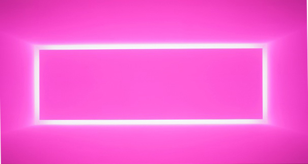
turrellJames Turrell: A Retrospective explores the artists use of landscape, light and shadows. There are installations of his lightboxes - colored lights projected on the walls in a warm glow which defied my understanding of the projectors. There are pictures of his building in the Western US with skylights and windows which frame the light in a majestic way - almost as a light inspired Stonehenge. Then there is the Breathing Light Room. You take off your shoes, walk up a short flight of stairs and enter an entire space filled with changing colors. This is a color theory class dream. As my eyes took in the all encompassing light in the room, if I closed my eyes the after effect on my lids was exceptional, if I looked back into the space before the stairs with the sad cubbies filled with shoes, another color filled the room. And they all kept changing. Seemingly, even the temperature in the room changed. Light room was an out of body, all sensory experience in color and light.

lacmaExpressionism: Van Gogh to Kandinsky was a museum experience I was used to, yet the art on show was spectacular. The color of the room itself was inviting in a dark navy, with an ipod app to guide you through the installation. (The only fault I could see was the type next to each painting was so small, only someone with young eyes could read the description while standing behind the safe line. However, most museum patrons tend to lack 20/20 vision and the chorus of guards asking the patrons to lean back was continuous. As a student, it was also really interesting to see which loaning museums allowed pictures of the work, which put in museum glass, and the ornate or stark frames chosen for the art..) I am always a sucker for Van Gogh, especially his Poplars and other landscapes - his brush strokes are mesmerizing. The colors of the Kandinsky and the Franz Marc were reminiscent of the after effect on Turrell. The installation flows from Impressionism to Cubism, and recounts the historical opinions of the art especially in Germany and France. I highly recommend the tour - just bring your reading glasses or the app!

April 12, 2014 - No Comments!

TYPO San Francisco

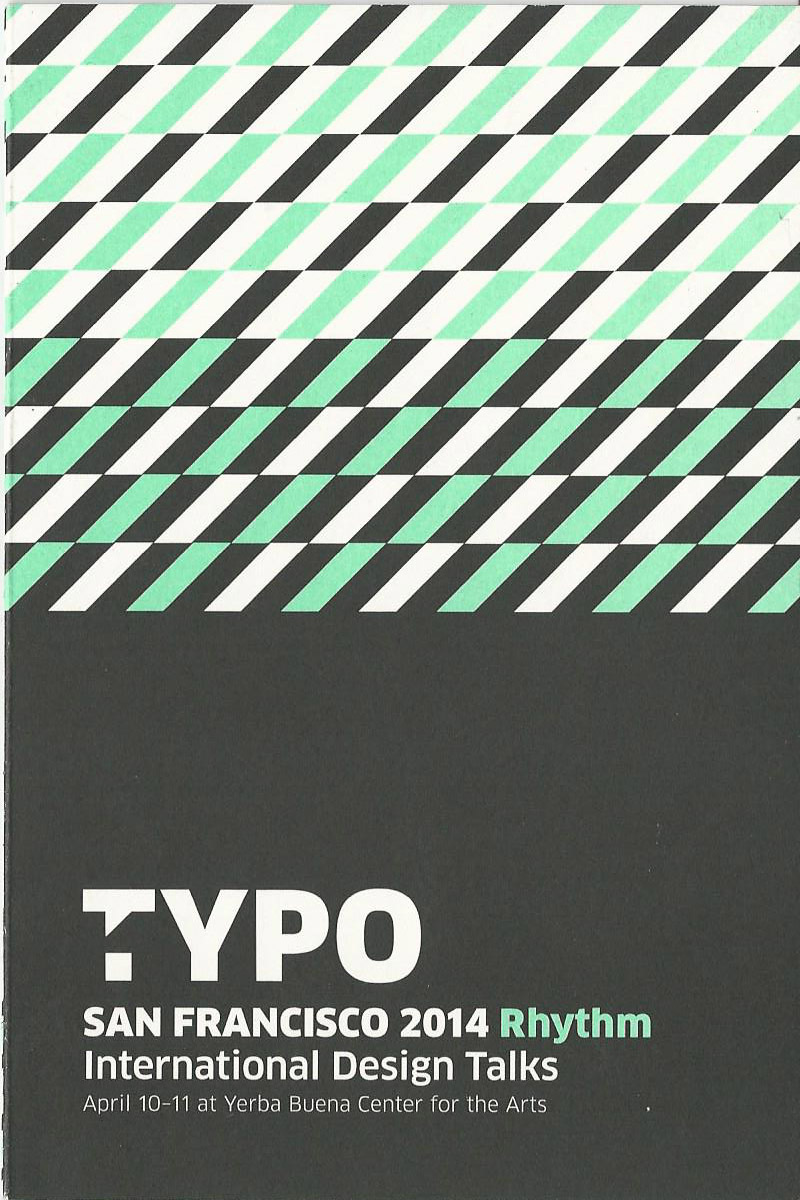
Typo brochureI have been to conferences, or what I thought were conferences.  These were women in business or structured finance conferences where you were there solely to mingle and the free coffee was necessary to keep you awake between the coffee breaks.

For anyone outside of graphic design, a conference on typography sounds incredibly strange.  One friend even asked me if day one was about serifs and day two was about sans.  Honestly, I had no idea what to expect either.  I was here for inspiration and if I wasn’t inspired, I’d hit Alcatraz and an early flight.

The theme of the conference was Rhythm, and whoever organized the playlist for the hold music had a great Itunes library - a varied play list including Miami Sound Machine and Frank Sinatra.

The conference opened to a full house with introductions by the organizers.  The host, although German, had a surprisingly ironic and haughty sense of humor.

The first speaker was Maria Popova who chose to discuss the rhythm/routine of her life.  I was particularly drawn to anyone who could stand in front of a theater of 600 people wearing a peplum top and fingerless bright yellow gloves.  The talk was quick and to the point.  The main takeaway - “no routine guarantees success, but having one leads to it.”

But then Rene Knip (“pink backwards”) took the stage.  A somewhat goofy Dutch man with a charming stance and presence who showed us photos of his farm and his family and his boats.  And then he took us on a trip of environmental typography.  Street signs photos turned into a game of scrabble, potato cuttings turned into an entire font.  His work was not necessarily about legibility, but about mood, about humor.  He exemplified someone who brings joy to their work and as a result beauty.

Gemma O’Brien, aka Mrs Eaves, took over the stage to a round of hearty applause.  Although quite young, she is quite accomplished, and her hand lettering is stunning.  She also treats her work (and her life) with a sense of humor.  She focused on crafting authenticity - as one’s eyes are the window to the soul, one’s handwriting is a form of true sincerity.  Her puke bag puns which she set as a challenge to herself on every flight were amazingly beautiful and endearing.

Luna Maurer discussed collaborative and conditional design.  It was like crowd sourcing for design and it blew me away.  Despite a series of explicit rules, the resulting work was beautiful, logical, and carefree.

Lisa Congdon opened day two.  She spoke about embracing the abyss - stepping out of your comfort zone.  Although she became an illustrator late in her career, her line drawings are magnificent.  She choses to give herself a challenge a day - to force herself outside of herself.  Lisa spoke about the combination of a the taste of success and the fear of vulnerability.  How she wanted to be perfect and unlock her creative genius before showing it to the world.  Sheryl Sandberg would have been aghast - although I was incredibly inspired.  I signed on to take her online drawing classes immediately.

George Zisiadis discussed art through electronics and his playful reimagining of the world.  He uses design “to subvert the things [he} doesn’t enjoy” and creates something imaginative, interactive and utterly playful.  He also gives himself daily challenges and wasn’t afraid to fail, as long as he was laughing.

The final speaker was Aaron Draplin.  He was a stocky, true blooded American - trucker hat, truck, loud music and a hearty laugh.  Despite appearances, he was incredibly knowledgeable and inspiring.  His message was about going for it and getting away with it.

I wasn’t sure what an ah-ha moment was.  I wasn’t expecting to laugh or cry or be amazed.  I had read the reviews.  I had read the bios of the speakers.  I wasn’t expecting all of the emotions.  All of the passion.  I was incredibly grateful to have the opportunity to be exposed to the world of design with such zeal.  I was amazed.  I was inspired.

As they said, do you what you love and it shows.

April 11, 2014 - No Comments!

The LA Cliche

traffic 1

Traffic: defined as vehicles moving on a road or public highway. The term is actually defined with the word “moving.” Obviously, the dictionary has never driven in Los Angeles

Before you move to Los Angeles, all you hear about is how bad the traffic is. We see skits about it on SNL, jokes about it in movies, and stories that the 405 is a topic in every conversation. I figured that this was all extreme joke, that Angelenos had no idea what traffic was (NY does everything better), and that it was just an excuse for the city to complain. What other excuse did they have to complain: the weather?

I have commuted from Connecticut to NYC and been stuck on the FDR for over 2 hours due to a small accident. I have been stuck on Metro North for hours due to snow. I have been forced to walk across the island of Manhattan due to a Taxi strike. I thought I knew traffic. Los Angeles traffic was laughing at me, hard.

There is something about a city where rush hour starts at 230PM, where your only alternative to being stuck in traffic in your car is to be stuck in traffic in Uber, where taking the freeway actually makes you later - it is called insanity. In NYC there is something called the “green wave.” The traffic lights are timed up the avenues in such a way that if you hit them properly you can drive for miles without hitting a red light, and this happens at any time of day. How does a city as large as Los Angeles seemingly not understand the simple math behind coordinating traffic lights?

According to one study, Angelenos spend over 72 hours annually in traffic, making it the worst commuter city in North America. Most of this traffic congestion lately is due to the ever continuing expansion project of the 405. Although I try to never take the 405, seems to me that it will need to be expanded again and it will remain a continually never ending project.

This is the city that created the terms Carmageddon, the Rampture, and Jamzilla when the 405 was closed on weekends for long stretches to accomplish some necessary work. Despite all the hype around these closures, traffic on these days was actually light - everyone stayed home as they were supposed to! (Carmageddon wasn’t special, just the day to day.)

Because of the congestion, most Angelenos (myself included) don’t leave their little nests of LA territory. I live on the West Side, and I hardly ever drive East of the 405. I went to a meeting in Los Feliz, and I had no idea where I was going or what neighborhoods I was passing through. I once went to Pasadena for the famed Flea Market, and I expected the town to be in the next state considering how long the guide books told me it would take to get there. But Pasadena is literally only 27 miles away! Just the next “suburb.” I commute to UCLA in the evenings, a mere 7 miles, and it has take me over 90 minutes on occasion. Los Angeles itself is a mere 469 square miles!!!

I am one of those people who get anxious when running late. I have had to learn to change my commuting rule - in NYC you can get anywhere in under 40 minutes. In LA, make that 90 minutes. I have learned to love NPR, satellite radio, and books on tape. I have learned that it is ok to laugh out loud hysterically to Comedy Central because despite the fact that I may look like a freak to the other drivers, I’d be crying if I actually thought about being stuck in traffic

I have always leased my cars, and in NYC, 15,000 miles per year would just about cover it. I ended up taking the subway a lot toward the end of my lease, so as not to have to pay for the extras. In LA, I laughed when the dealer suggested that I would be fine at only 10,000 annually. Amazingly, despite the nightmare that is LA, Angelenos actually only drive on average 23 miles per resident per day. Hardly ranking LA in the top 20 of US cities for commuting.

The residents of LA get a lot of stereotypes. One of them is the love of their cars. I don’t think this is unwarranted. Los Angeles neighborhoods can now be defined by counting Range Rovers, Priuses (or is that Pria?), Mini Coopers and Teslas. Despite the sprawling city, the over abundance of cars, can we please design a parking spot the size of an actual car?

If you come to LA, take to the streets. Just know that if you walk, you will probably be the only one on the sidewalk, and if you drive, you’ll have good company. You’ll want to stock your car and get comfy!